
Before Deliberate Signals, I was Director of Product Ops and Customer Insights at Foreground, the company behind ShootProof and Táve Studio Manager, now VSCO Studio Manager. Our product team was not short on data. That was most of the problem.
If your reaction is “we already have dashboards,” I believe you. Almost everyone does. The question worth asking is whether anyone opens them on a Tuesday afternoon with a real decision in front of them. Ours mostly got opened when someone asked me to pull something, and a request queue is not the same thing as a dashboard.
Every question cost a person. Someone wanted to know how a segment used a feature, so I pulled a report. Someone wanted survey comments sitting next to that usage, so I pulled two sources and stitched them together by hand. None of it was hard work. It was slow, and it put me in the middle of every question, which quietly meant fewer questions got asked at all.
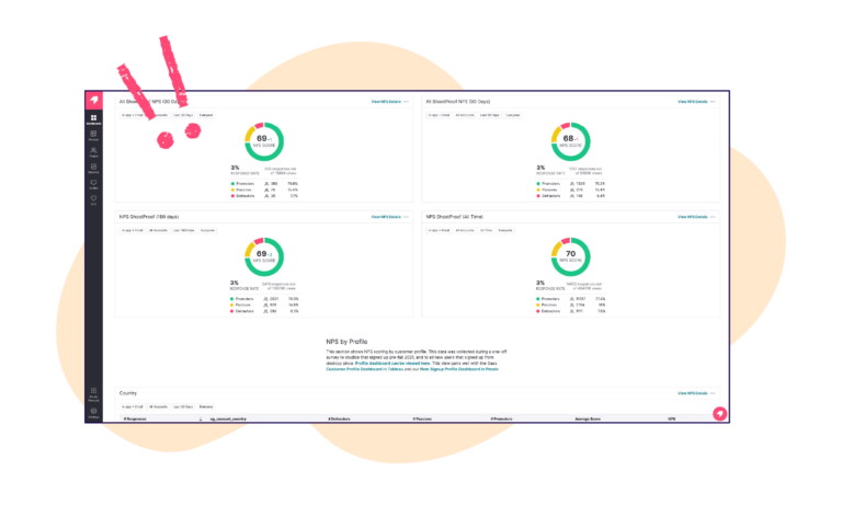
We moved that work into Pendo dashboards. Not because the tool is special, but because it let us hold the numbers and the stories in one view. That phrase stuck with me, and I still use it with clients. The full case study is on Pendo’s blog if you want the original write-up. What follows is what I would actually tell you to copy.
Ask it out loud before you build anything. If the answer takes you more than a sentence, you are not ready to build yet.
A dashboard with no question behind it turns into a wall of charts that everyone scrolls past. Put the question in the title. “Which accounts slowed down last month” is a dashboard. “Product Metrics” is a filing cabinet. If you cannot name the question, you are building a report, not a dashboard.
Look at your current setup and ask where the qualitative data lives. If the answer is a different tool, or a spreadsheet somebody maintains, you have found the gap.
Usage data on its own is a smoke alarm. It tells you something is happening, not what is burning. A drop in a feature could be a bug, a confusing change, or a seasonal pattern that means nothing at all. The verbatim comment sitting next to that chart is usually what tells you which one it is.
Putting both in one view changed what our team could see. Differences between personas stopped being something you argued about from anecdotes and became something you could point at. If you are building the qualitative half of this, I wrote separately about putting a Voice of Customer report together.
Name that person before you build. Not a team, a person.
A dashboard whose only visitor is the person who built it has not been adopted, it has been tolerated. The signal that ours had landed was not a usage stat. It was marketing pulling from it on their own to shape targeting, without routing the request through me first. That is the bar. Somebody outside the team that built it uses it to make a decision.
This is the same pattern behind why customer success teams ignore Pendo. Access was never the blocker. Nobody had built them a view that answered a question they actually had.
Accessible does not mean everyone gets everything. It is tempting to read “make data accessible to the whole org” as opening the doors and calling it done. What it actually takes is giving each group one view they can act on, and being willing to delete the rest.
And none of this holds up if the foundation underneath is shaky. If visitor and account IDs are unreliable or tagging has drifted, a centralized dashboard just centralizes the error and gives it a nicer frame. That is worth fixing before you build anything on top of it.

Try one thing this week: open the dashboard your team looks at most and write the question it answers at the top of it. If you cannot, you have learned something useful about why nobody opens it.
If your product data is scattered across tools and someone on your team is the human API holding it together, I am happy to talk through what centralizing it would look like. I offer a free 30-minute Pendo strategy session, no pitch, just a working conversation about your setup and where the quickest wins are.
One question’s worth of data, and both halves of it. Pair the usage numbers with the qualitative feedback that explains them, rather than splitting them across two tools. If a widget would not change what someone does this week, it is decoration.
Name the specific person who should open it before you build it, and put the question it answers in the title. Adoption shows up when someone outside the team that built it uses it to make a decision without asking for help first.
Yes, and that pairing is the main reason to centralize in the first place. Usage tells you what happened; survey responses and open text feedback tell you why. Holding them in one view is what stops teams from arguing over anecdotes.
The data foundation. If visitor and account IDs are unreliable or tagging is inconsistent, centralizing simply gathers the errors into one place and makes them look authoritative. Fix identity and tagging first, then build.
Related reading: product operations for smaller companies and 5 signs your platform needs governance.